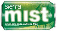
 PepsiCo is making some changes in the looks of some of its drinks containers. Perhaps the most confusing is the new image of Sierra Mist. As is evident in the image at right, the word "Mist" has been blurred.
The Purchase, NY-based soft drink and snacks giant says it will invest $1.2 billion over the next three years to reinvigorate its line of carbonated soft drinks in the face of consumer demand falling off for virtually all brands in the past 36 months.
 Initially, the campaign will include new logos and packages for PepsiCo beverages. The red, white and blue Pepsi logo began as a bottle-cap design, became the official logo in 1962, and was last changed in 2002. The new version will eliminate the wave look, which will be replaced by a diagonal slit the company says is supposed to represent a smile.
Among other brands to undergo a renewal are Mountain Dew's various iterations.
To Dowd's Wine Notebook latest entry.
To Dowd's Spirits Notebook
To Dowd's Brews Notebook latest entry.
To Dowd's Non-Alcohol Drinks Notebook latest entry.
To Dowd's Tasting Notes latest entry.
Back to Dowd On Drinks home page.
No comments:
Post a Comment